|
DESIGN
PRINCIPLES AND TIPS
You
have only a moment to engage the short attention span of a
Web-surfer, so seize the opportunity (unless, of course,
as in my case, you have a captive audience of students who
are required to use the site).
some
cardinal rules of site design (one could add others)
1.
The Supreme Directive: Form
really does follow function
2. The top page
can therefore make or break you
3. Don't let your
visitors get lost
4. Attractive, not
flashy
5. Powerful writing,
not overwriting
(1)
They're
here, stupid! Now what do you do? Or: Form
really does follow function.
An
antiques dealer who had taken to selling on the Web drove
home the point for me early in the days of e-commerce when
he wrote the following simple truth in a trade journal: There
is a world of difference between a traditional advertisement
and a business web site.
In
the case of an advertisement on television or in a print publication,
the aim is to distract you from what you are doing or want
to do: to keep you from getting up and getting that sandwich
or going to the bathroom during the timeout in that football
game, or to draw your attention away from that fascinating
article about war or political scandal.
In
the case of a web site, by contrast, the visitors/readers
have already found their way to you. They don't need to be
attracted or distracted because they are already where
you want them.
They
are already there because they believe you have something
they want: information. Whether or how long they stay
(and/or return) will depend on your ability to deliver it.
Is that so hard? Can you be so cruel or stupid as to deny
it to them?
These
principles are derived from commerce but apply to academic
sites (or any other), as well, and all else follows from them.
(2)
Don't breathe that sigh of relief yet.
Now that your visitors are here, you have to persuade them
that they really are in the right place. In other words, this
deal is yours to lose, buddy. Your top page must be informative,
clear, and attractive.
•
Your top page should be able to fit the essentials on one
screen set to a standard resolution: without getting into
too much technical detail, no more than 800 pixels wide and
600 high. Never go wider. You can produce a longer page, but
just make sure that the most important information is readily
visible at the top.
The
top page tells visitors what to expect. It is the jacket
of the book and the table of contents rolled into one.
This
should not be a complicated task (and when in doubt: simpler
is better). All you need is a clean design that tells visitors
who you are and directs them to principal further pages/levels
of the site.
The
structure of your site must reflect the structure of your
ideas. A generic hierarchical cluster suffices for most
sites:
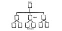
enlarge
from
an early manual: William Horton, Lee Taylor, Arthur Ignacio,
and Nancy L. Hoft, The Web Page Design Cookbook (NY:
John Wiley and Sons, Inc., 1996), 505. (Since the authors
[p. iv] urge users to "copy something that already works"
and declare, "Never draw or type something that you can
cut and paste," I have taken them at their word and scanned
the above diagram.)
Here
are a few examples of good top pages, chosen from widely
varying sources:
— Decameron
Web (from Brown University; a fine example, despite the
violation of the width rule)
— Daniel
Warner, Composer (Hampshire faculty)
— Dagmar
Lorenz (German freelance journalist)
— Martin
Luther House (Germany)
— American
Antiquarian Society (Worcester, MA)
— Alexander
von Humboldt—Networks of Knowledge (Germany)
— Bibliothèque
nationale (French National Library)
They
range from simple to complex and conventional to avant-garde,
but all deliver the goods, which is what the visitor needs.
By
contrast, look at these pages. The result is all too often
relatively cluttered and confusing (to my tired eyes,
at any rate).
—
Jones Library (Amherst)
note how fonts and layout do not reflect importance of information
— masslive
(Western Massachusetts)
—
New York
Times
For
example, note how difficult it is to translate the aesthetic
of the newspaper to the screen—and this applies even
to the efforts of the largest and most sophisticated enterprises.
Still, even this task is not impossible. Compare the above
with the following:
•
Süddeutsche
Zeitung (Germany)
(3)
The top page tells visitors what to expect. Now you have to
help them find it.
Don't
let your visitors get lost! Navigation must be logical
and simple: Interested visitors will follow you anywhere,
but they also (a) like to strike out on their own, and (b)
need to know how to get back home.
Navigation
aids can take various forms and display various degrees of
sophistication, but at the least, every page should have a
link that will take the surfer back to the home page of the
site or start page of the current section. (Ideally, it should
also be able to point visitors to other principal divisions
of the site.)
(4)
Attractive, not flashy! (no pun intended; well,...perhaps).
There
seems to be a rule, in web design, as in the military, that
once a new technology has been developed, there is an overwhelming
temptation for everyone to try it out. Resist that temptation.
The fact that you can do something doesn't mean
that you have to.
Given
that the eager (or at least curious) visitors are already
at your site, relax! As explained above, they are favorably
inclined toward you, merely seeking information. Nothing is
more guaranteed to drive them away than a slow-loading page
or gimmicky design that keeps from getting to what they want
as soon as possible.
Avoid
pointless eye candy (actually, a misnomer if ever there was
one, because most of this stuff is hideous).
Keep
things simple. Your design should indeed be attractive,
but remember that it is subordinate to the purpose of delighting
the eye and directing attention to the most important resources
on the site.
There
are ethical and practical as well as aesthetic dimensions
to this admonition: If you go overboard in use of high-end
technology, you may exclude users with older computers or
slower connections.
(5)
This more or less follows from the preceding, but as because
it concerns the word, it bears emphasizing. More is less.
Again, the visitors are already there:
•
Welcome them by declining to treat them as fools.
• Hype, jargon, and other departures from reader expectation
are a turn-off.
• If the visitors didn't think you had something to offer,
they wouldn't be there. If, by contrast, you seek to inflate
your own importance through exaggerated claims or inflated
language, the visitors will become suspicious.
• Choose your words carefully, to be sure—but
be yourself and be clear: That's all that anyone could ask.
Miscellany
more on images
The coming of technology that allowed the ordinary computer
user to create and transform images and "publish"
them on the Web was an exciting development, and so, the natural
response was to go overboard. The aesthetics of the medium
are still evolving.
As
a rule, though, images serve several basic functions:
• to direct the visitor's attention to especially
important content.
• to illustrate a point relating to "content"
An attractive site is a virtue in its own right, but just
be sure that your use of graphics truly attracts rather than
detracts.
For example, it is difficult to employ an image as the background
to text; the two often clash. Legibility should be your primary
goal.
A few well-chosen images are better than a plethora.
a
fine example of clean design, from a site devoted to the
American expeditions of the scientist Alexander von Humboldt
Remember, too, that large image files can take a long time
to load (not all visitors will have high-speed connections
to the Internet). There are of course places where larger
images are desirable or even essential—so a good compromise
is to place small "thumbnail" images on your page,
linked to files containing the larger versions. Consider this
representative
page on African art from the Metropolitan Museum of Art
in New York.
What
if I do need a longer text somewhere? I don't want
to write a baby book!
Despite
the convention of brevity, there may be a perfectly sound
reason to include a large chunk of uninterrupted text (whether
a primary source or the results of your own analysis) in an
academic site.
The
Web is ideal for "publishing" document "archives."
It is also a a very good place to post a formal paper, whether
a draft for comment or a final version for general distribution.
In
both cases, the most effective strategy would be to place
that material on a "deeper" level of the site.
Because
visitors may well want to print out such a lengthy document,
many designers put it on a single page (or offer an
additional version in a single-page format; see how journalistic
web sites handle the task). An alternative and increasingly
popular solution is the posting of the document as a PDF
(Adobe Portable Document Format). PDF's are downloadable and
printable, but unlike text files, they are not searchable
(a trait that helps to hinder plagiarism).
|


